INDEPENDENCE CYBER SECURITY AGENTS | BRANDING
Independence Cybersecurity Agents acts as the trusted, independent agent for their clients. They provide expert market analysis and strategic guidance to help them build effective, cost-efficient security programs by navigating the complexities of the vendor landscape on their behalf. The brand needed to capture Integrity, trust, advocacy, independence, experience, history, and heritage.
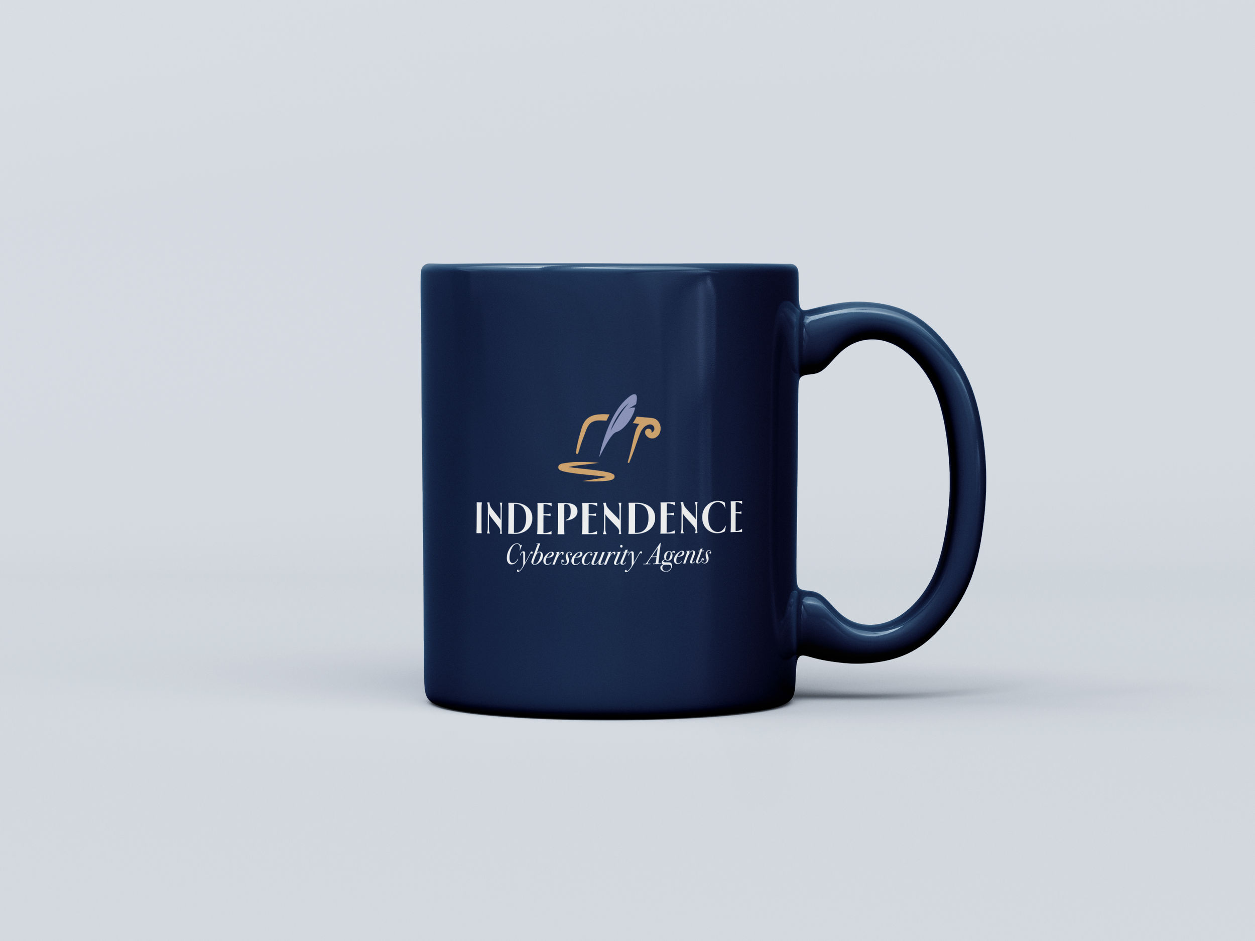
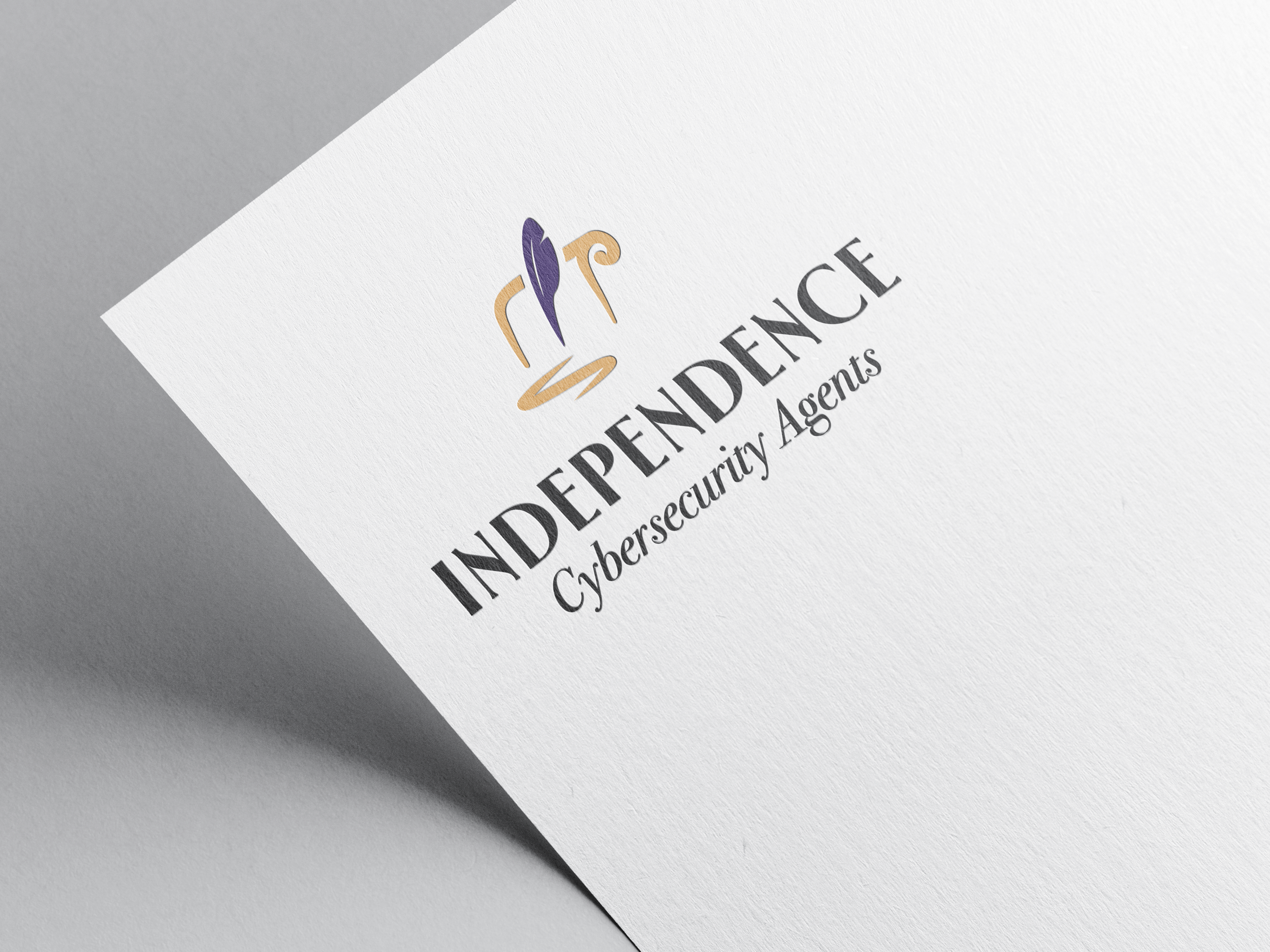
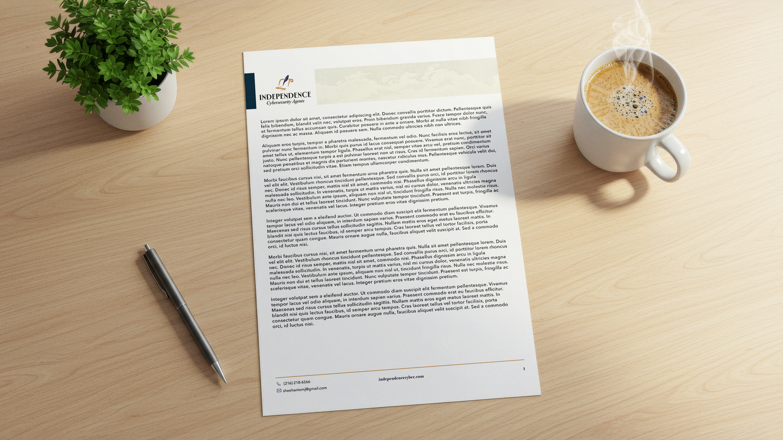
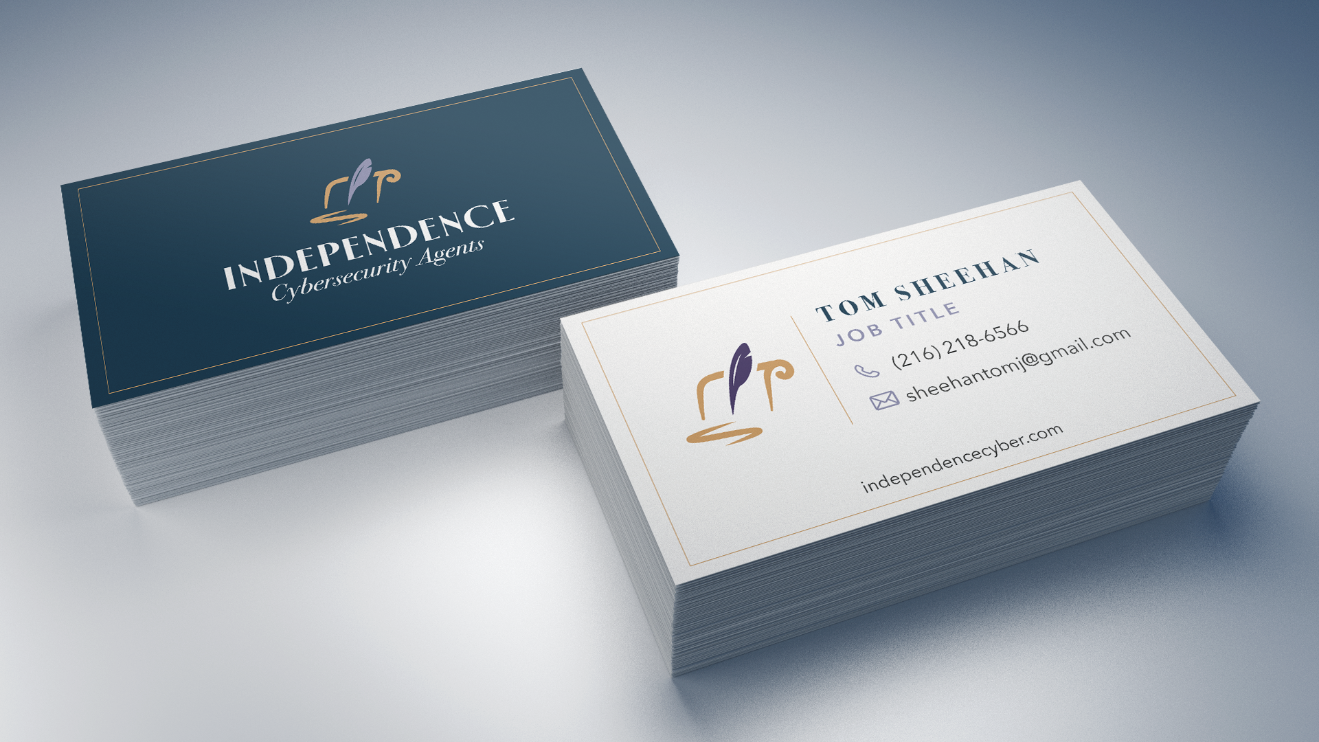
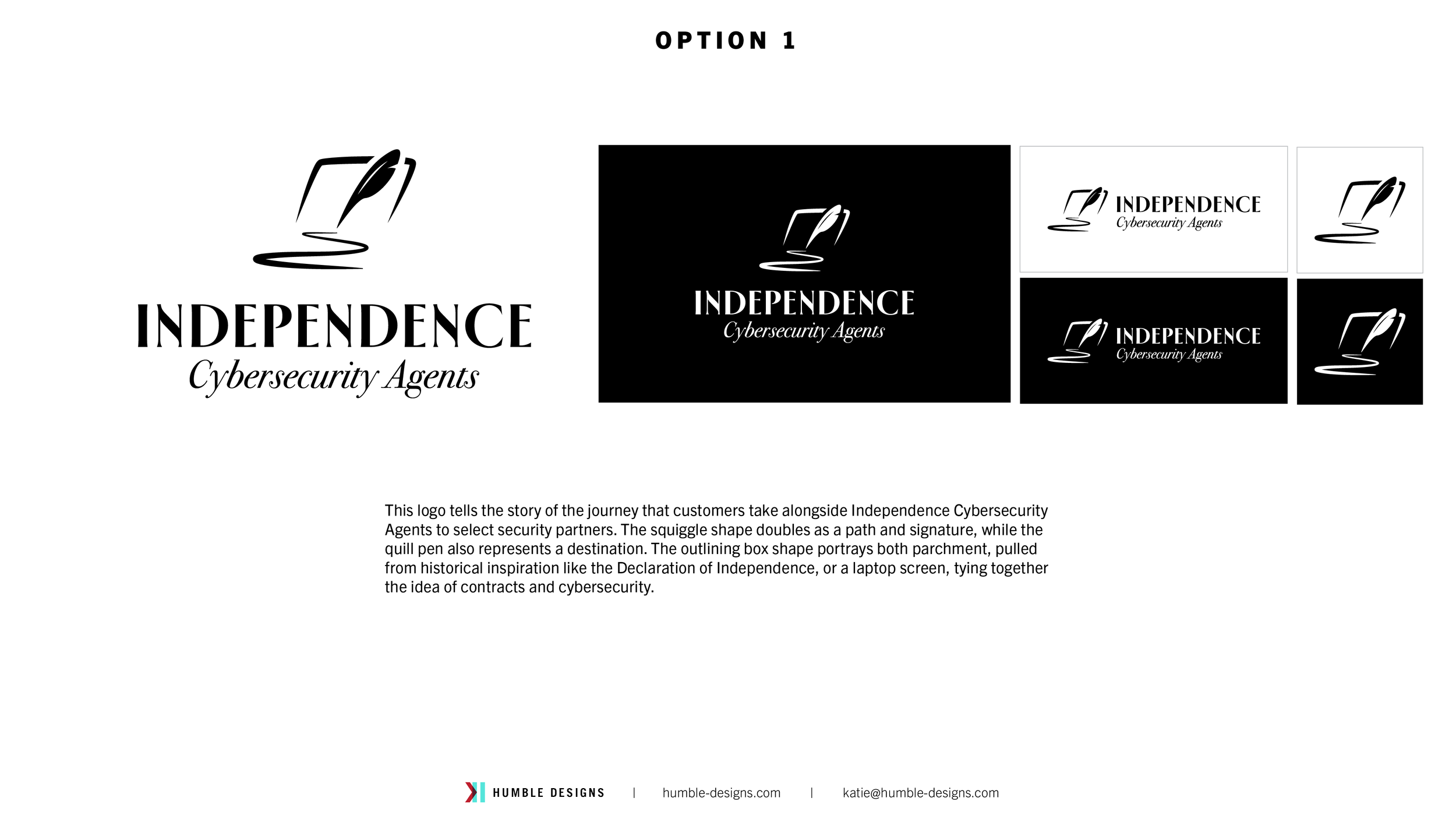
This logo tells the story of the journey that customers take alongside Independence Cybersecurity Agents to select security partners. The squiggle shape doubles as a path and signature, while the quill pen also represents a destination. The outlining box shape portrays both parchment, pulled from historical inspiration like the Declaration of Independence, and a laptop screen, tying together the idea of contracts and cybersecurity.

Process
Mood Boards
Option 1 (The winning option!)
HERIGAGE | BOLD | EXPERIENCED
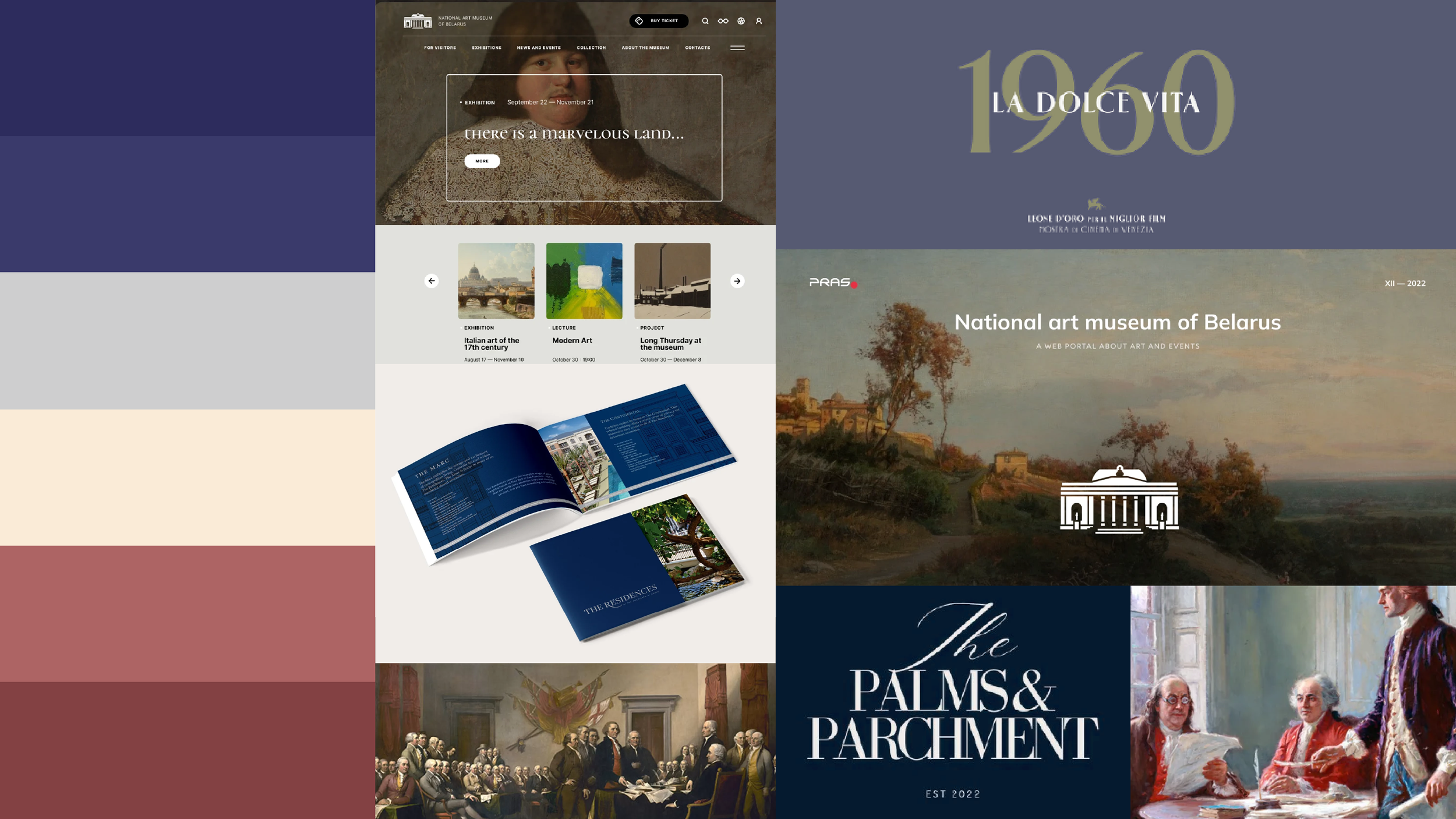
With colors pulled from historic paintings like John Trumbull’s Declaration of Independence, this mood board drives a brand that is rooted in history and experience - just like Independence Cybersecurity Agents.
Pulling design inspiration from museums, the brand would have a polished, trustworthy feel with clear and bold typography balanced with rich muted colors.
This direction inspires feelings of experience and professionalism.
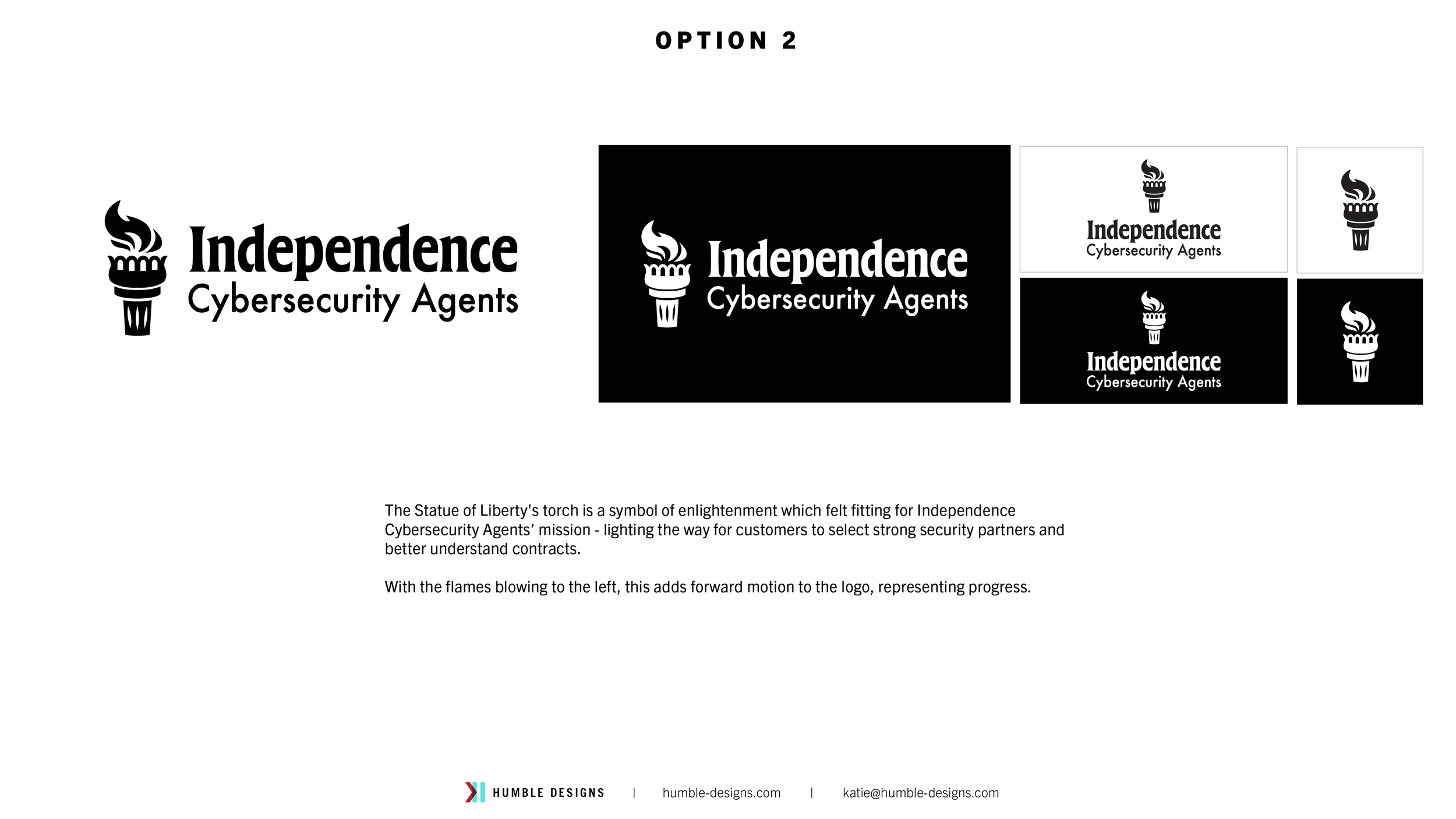
Option 2
TRUST | CALMING | TANGIBLE
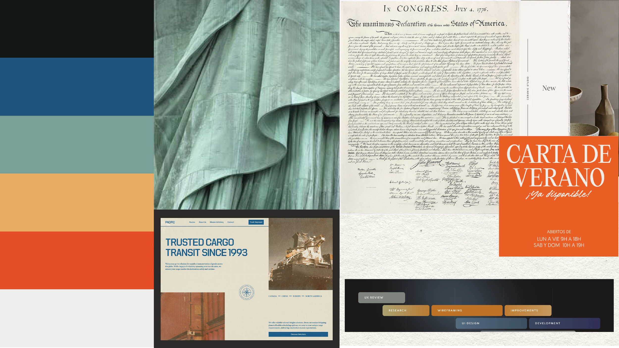
Pulling texture and warm colors from historic symbols such as the Declaration of Independence and the Statue of Liberty, this direction brings a tangible element to the brand and create a warm and inviting feel.
Use of soft and subtle parchment texture adds dimension and sense of realness. Use of textured paper in physical print material brings an elevated look and helps materials stand out to create memorable experiences.
The color palette for this direction is warmer, bringing a sense of calm as Independence Cybersecurity Agents help guide clients through the process of selecting security partners.
Initial Logo Designs
The first logos are shown in black and white to allow the design to come forward and avoid any reactions due to color.
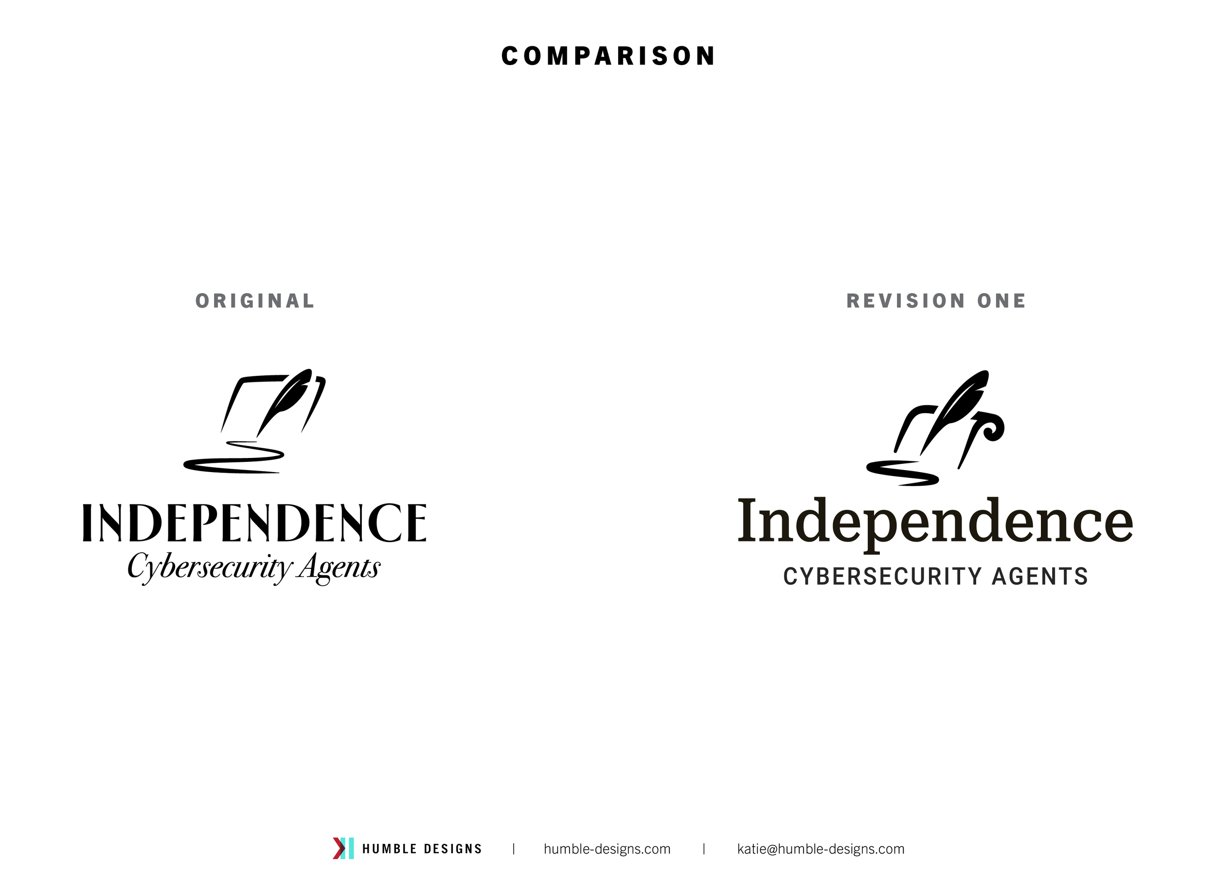
First Revision
Updates:
- Increased scale of the quill to make it the main focus
- Added curl to the laptop shape to more closely represent a scroll
- Reduced scale of the signature/road to balance logo elements
- Increased the thickness of the logo elements to strengthen legibility at a small scale
- Updated typography to better pair with the updated design
SECOND Revision
Updates:
- Reshaped the parchment and angle of the quill to make the design more square
- Replaced type with fonts from the initial design
- Updated colors